9 Things That Should Be On Your Wedding Mood Board
-
 Patricia T. Eliason | 29 May, 2026
Sneak Peak - Inspiration Gallery
What's Inside


If you are anything like me, you’d spend hours on Pinterest saving beautiful photos, opens Canva, drops in a pretty grid of images, and calls it a mood board. Then she emails it to her florist and gets a response that says something like, “This is lovely! What colors are you leaning toward?” And she thinks, “But I just showed you.”
Here is the problem. Most wedding mood boards look beautiful but do not actually communicate anything useful to the vendors who need them most. A florist, a photographer, and a cake designer are all looking at your board for completely different things. If those things are not on there, everyone is just guessing.
I have helped brides plan weddings on budgets ranging from $6,000 to well over $50,000, and the ones whose weddings came together most smoothly all had one thing in common. Their mood boards were actually functional. Not just pretty. So here is exactly what should be on yours, and why each piece matters more than you think.
1. Your Anchor Color and Two Supporting Colors
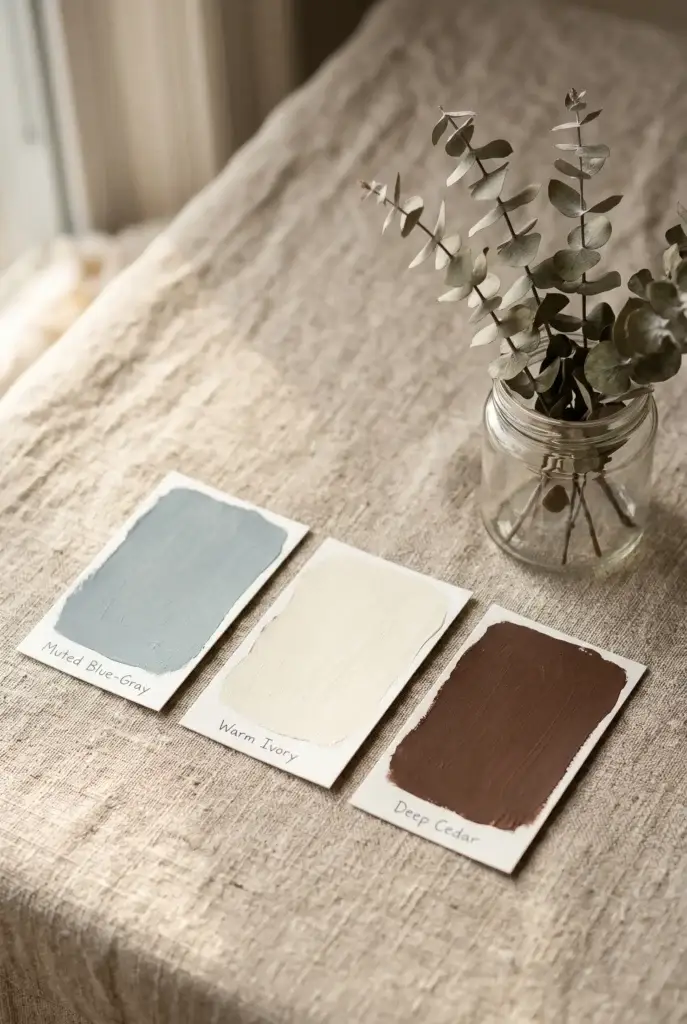
Not a vague color story. Not “blush and earthy tones.” Three specific shades with hex codes if you can manage it, or at minimum actual paint swatch images. One anchor color that dominates, one secondary, one accent. Your florist uses this to order blooms weeks in advance. Your baker uses this for fondant mixing. Your stationer uses this before a single proof gets sent to you. If all they see is a collage of pinks and greens, every vendor will interpret those differently. Adobe Color is free and takes about four minutes to lock in a palette you can actually share. I put our specific blue-gray, ivory, and cedar tones on every single document I sent to vendors for my own lakeside wedding in Wisconsin, and nothing came back off-color. That is not a coincidence.
2. A Lighting Reference Image
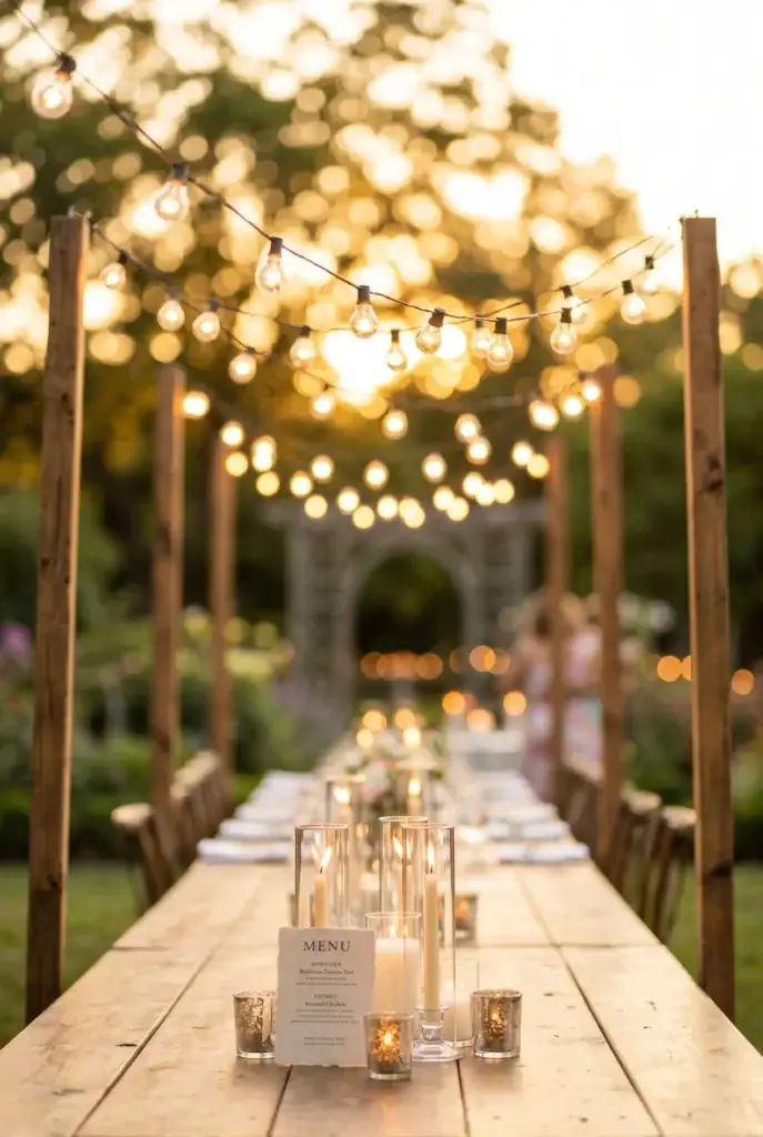
This is the one nobody includes and it is the most important thing your photographer needs to see. Lighting is not a detail. It is the entire mood. There is a massive difference between warm candlelit twinkle-string reception photos and clean bright editorial shots taken in open shade. Both are beautiful but they require completely different approaches. Find one image, just one, that captures how you want the light to feel in photos. Golden hour warmth? Moody and dim? Airy and bright? Pin it and label it. Outdoor string light setups can run anywhere from $300 to $2,000 depending on the venue and the installer, so knowing this early also helps you budget the right line item before you are deep into vendor contracts.
3. One Ceremony Backdrop Image
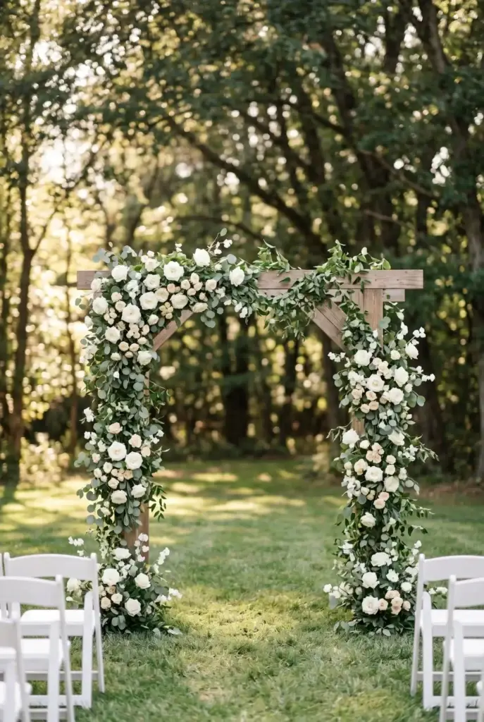
Not ten arch inspo photos. One. Pick the one that best represents what you actually want behind you when you say your vows, whether that is a lush floral arch, pampas grass in a simple wood frame, barn doors draped in greenery, or a completely clean outdoor backdrop with nothing but trees. Your florist and your decorator split their quote around this image more than almost anything else on the board. A fully floral arch can cost $800 to $3,500 depending on bloom types and scale. A simple greenery and pampas option might run $300 to $600. That is not a small difference and the quote starts with this one image, so be specific.
4. A Tablescape Flat-Lay or Reception Table Photo
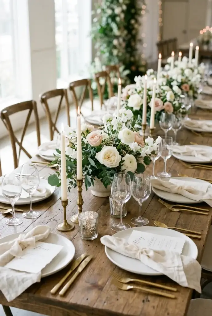
Your reception tables are the focal point of the room for three to four hours straight. Guests stare at them, photograph them, and remember them. More importantly, your caterer, rental company, and decorator all need to see this image because their work overlaps on that table surface. Do you want a minimalist look with simple greenery runners and taper candles? A lush, colorful tablescape with full flower centerpieces? Or something in between, like a mix of bud vases and pillar candles? Rental linens alone run $18 to $45 per table. Centerpiece costs range from $85 on the low end for DIY-style simple arrangements to $300 and up for full florals. One clear image stops the guessing game for everyone involved.
5. Your Dress Silhouette (Not the Exact Dress)
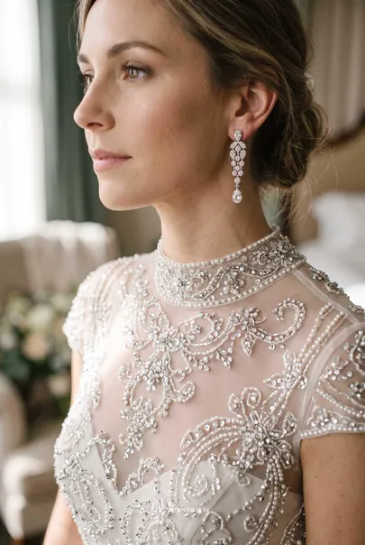
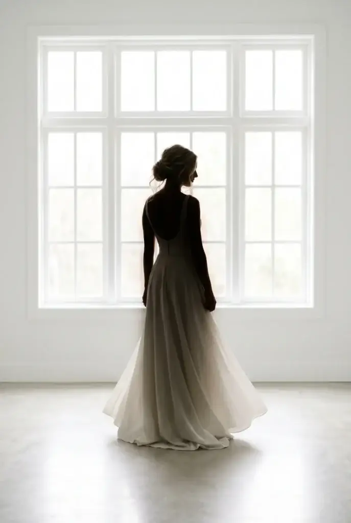
You do not need to have bought your dress yet to include this. A silhouette photo, whether that is an A-line, a ballgown, a fitted crepe column, or a flowy boho style, tells your photographer how to pose you, tells your videographer how to frame your shots, and honestly helps your florist size your bouquet correctly. A big ballgown needs a larger, more structured bouquet so it does not disappear visually. A sleek fitted dress pairs better with something smaller and more intentional. Your hairstylist and makeup artist are also looking at this image because the style needs to complement the neckline and vibe of the dress. It is one of the most cross-functional images on the entire board.
6. A Texture or Material Reference
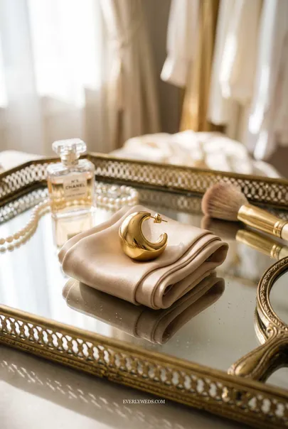
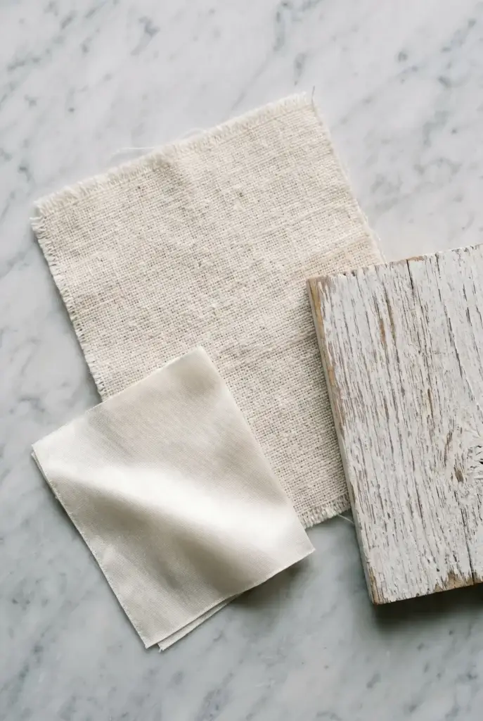
This one surprises brides every time I bring it up. A texture image, think raw linen, smooth satin, weathered wood, velvet, hammered copper, birch bark, or even a specific stone surface, sets the material language of the whole wedding. It tells your cake designer whether you want smooth fondant or organic buttercream. It tells your rental company whether to pull wooden farm tables or white folding tables with linens. It tells your stationer whether to go for a letterpress feel or a glossy digital print. It is a quiet image but it does a lot of heavy lifting. If you are planning a timeless, classy wedding aesthetic, linen and natural wood say that instantly. If you are going for something more modern, marble and brushed metal communicate that just as fast.
7. A Font Pairing Sample
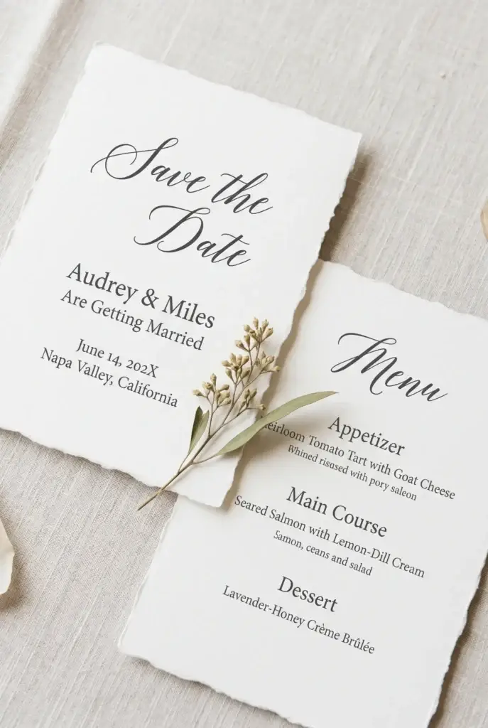
Most brides skip this entirely and then wonder why their signage, menus, escort cards, and wedding website all feel slightly disconnected from each other. You do not need to be a designer to pull two fonts that feel right together. Google Fonts is free. Dafont is free. A simple screenshot of a script font paired with a clean serif can go on your board and immediately ties together everything text-based across your whole wedding. Your stationer will love you for it. So will whoever is designing your wedding website, your signage, and your programs. A classic pairing like a romantic script headline with a clean modern serif body font works beautifully for a timeless wedding theme. A bolder all-caps sans-serif approach leans more modern and editorial. Pick your lane early and the whole brand of your wedding follows naturally.
8. A Bouquet or Floral Style Image
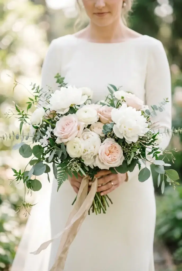
This is the one your florist is hunting for the second they open your board. Not a color reference, not a general “romantic and airy” description, but an actual photo of a bouquet or floral arrangement in the style you love. Garden-style and loose? Tight and structured? All greenery with minimal blooms? Dried florals with pampas? The difference in price between a simple greenery and eucalyptus bouquet ($95 to $175) and a fully loaded garden bouquet with peonies and garden roses ($250 to $450) is real money and it starts with this image. I always tell brides to add a note right next to this image on the board that says something like “love this style but open to local and in-season substitutes.” That one sentence saves you from being quoted on out-of-season blooms that blow the budget.
9. One “No” Image
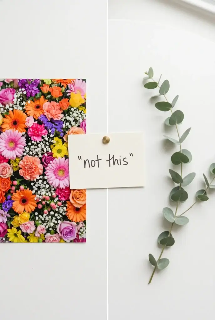
I know this sounds strange but it is one of the most useful things on the whole board. One photo of something you absolutely do not want. Not to be negative, just to be precise. If you hate over-the-top bright pink and everyone keeps pulling in that direction, one image labeled “not this vibe” clears it up faster than any description can. If you love rustic but do not want it to look like a barn sale, show the barn sale photo with a note. If you want minimalist but not cold and sterile, a cold and sterile photo labeled “too minimal” draws the boundary perfectly. Vendors work with a lot of brides. A “no” image tells them exactly where your style stops and saves rounds of back-and-forth on quotes and proposals that miss the mark.